Designing High-Impact Hero Surfaces at Scale
As Lead Product Designer, I set the direction for the product’s most visible experiences. I defined hero patterns that balanced brand expression and clear user direction, while coaching designers to make confident decisions that shaped the customer journey from the very first interaction.
Design Direction at a Glance
Focus
High-impact hero sections across landing pages and key journeys, where first impressions and trust matter most.
Role
Led design standards, reviewed work, coached three designers, and made critical trade-offs between brand, clarity, and usability.
Impact
Created a shared visual language, established repeatable hero patterns, and increased team confidence in making design decisions independently.
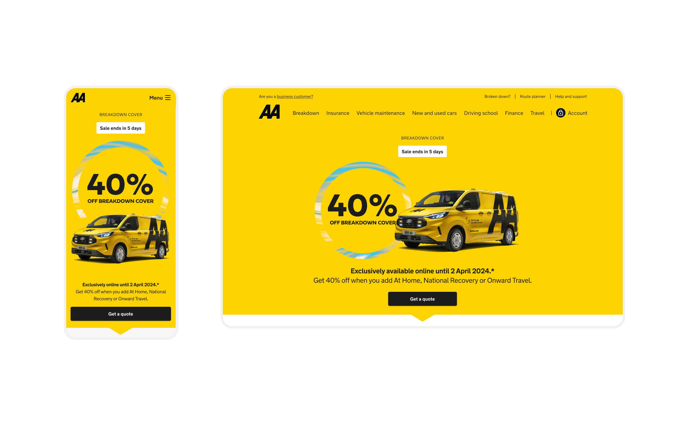
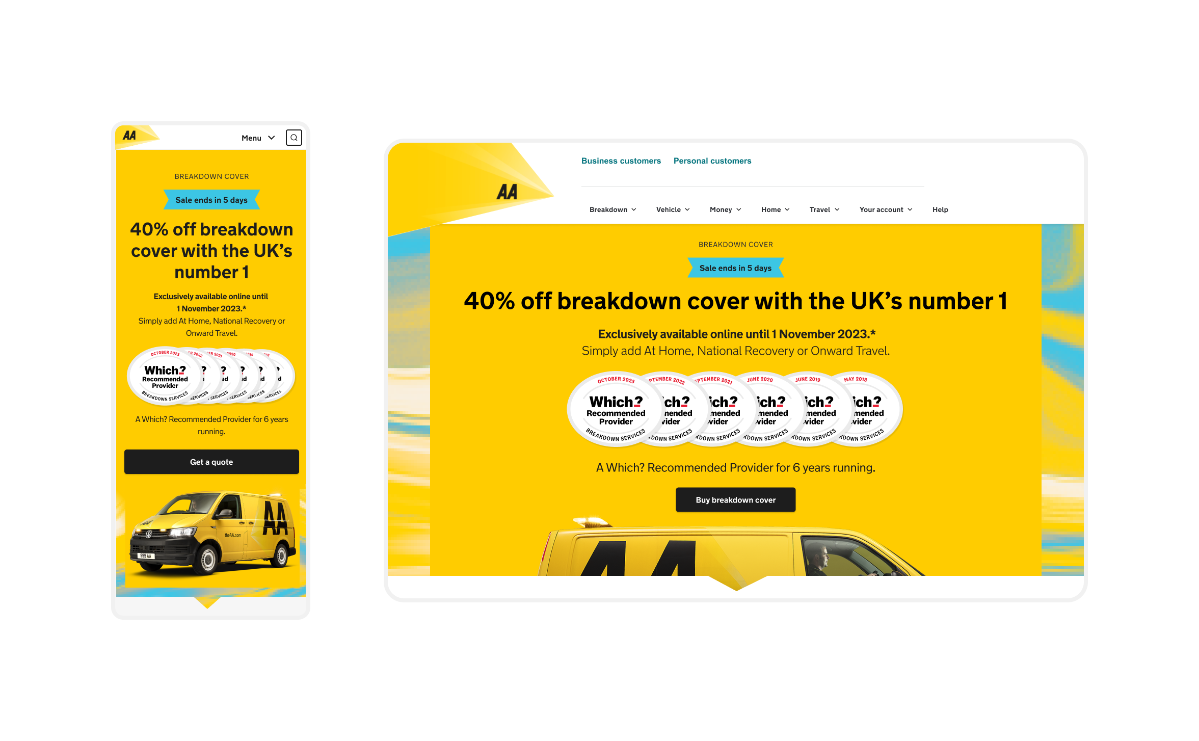
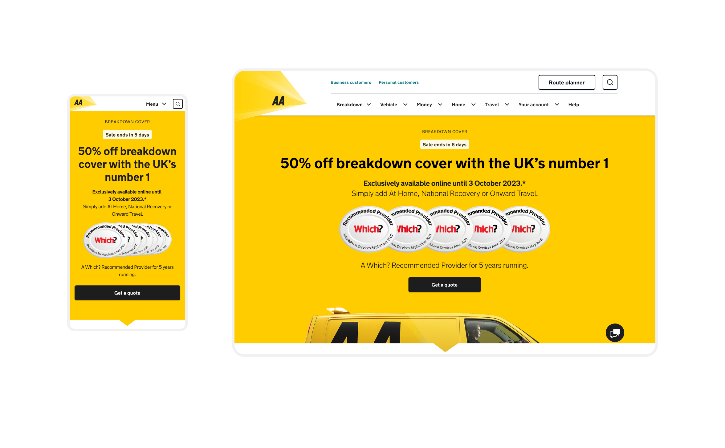
Selected Hero Surfaces
These surfaces are presented in reverse chronological order, starting with the most recent iterations. They illustrate how the design system and visual language evolved over time in response to constraints, learnings, and product maturity, while highlighting the leadership decisions that guided the team.
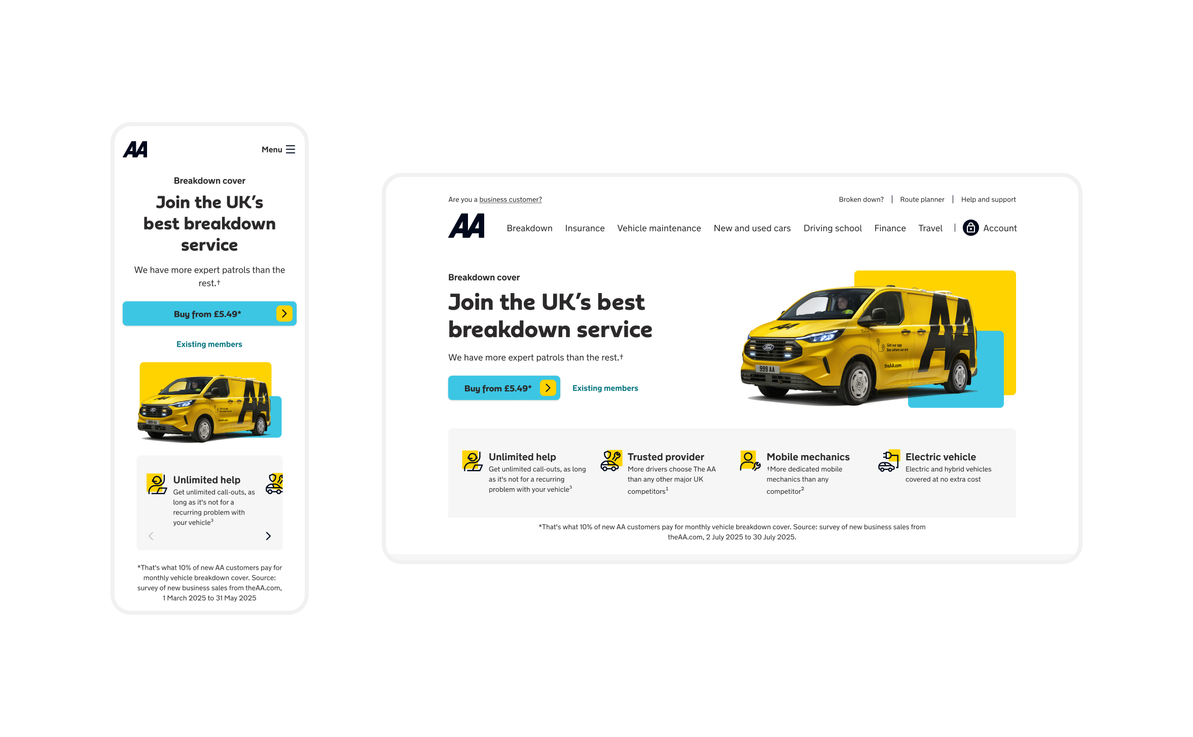

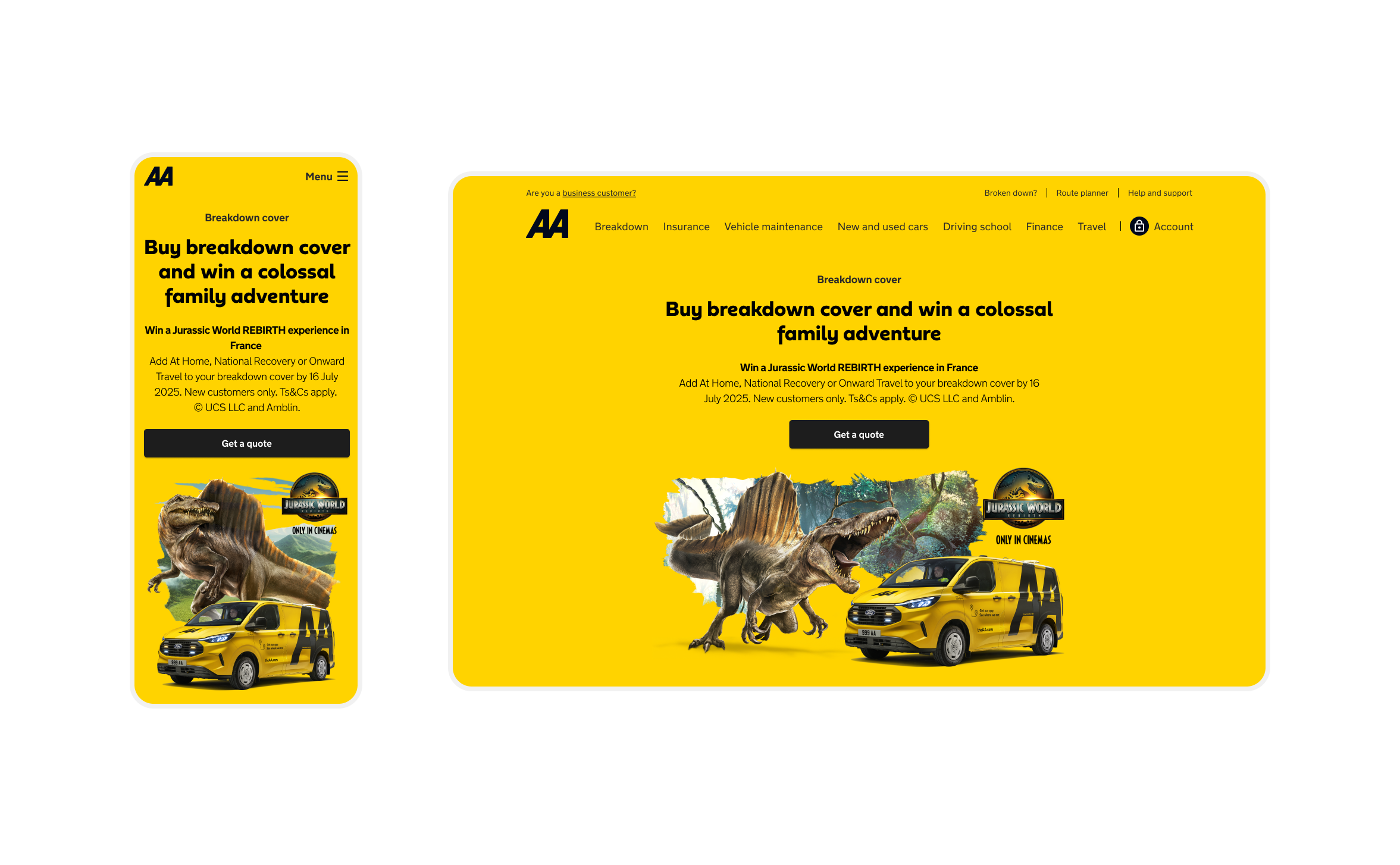
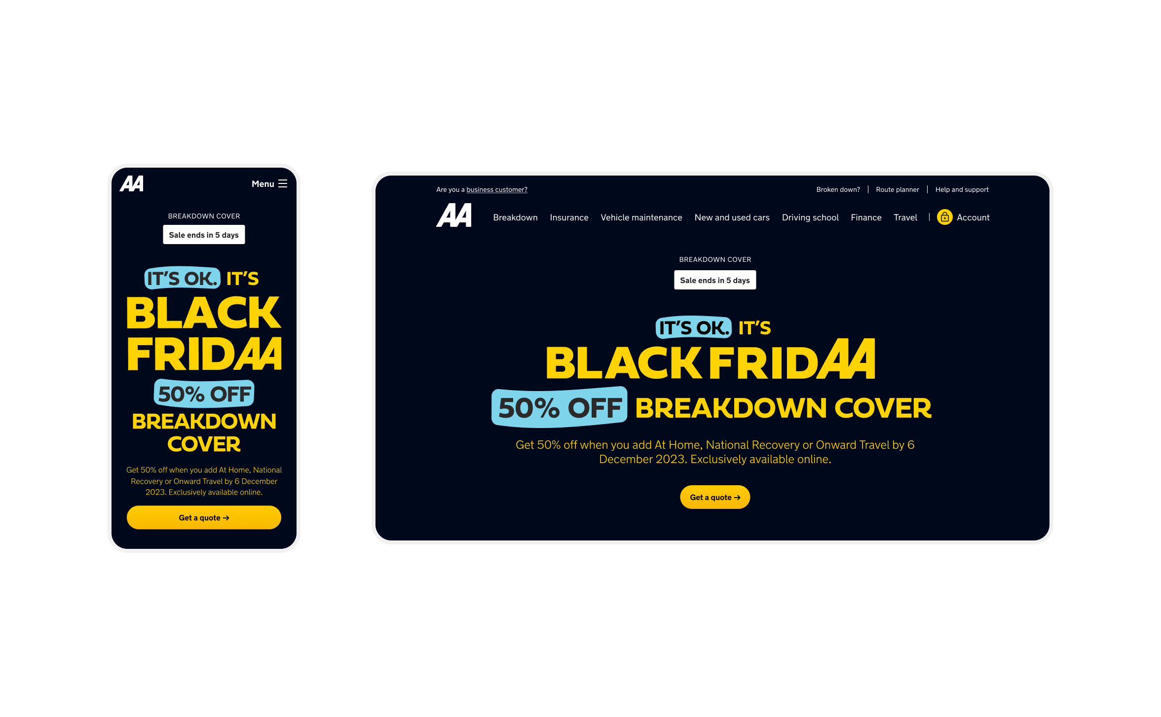
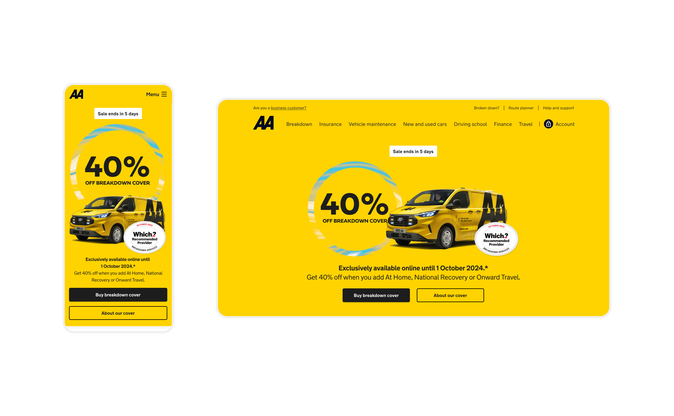
Why Hero Surfaces Matter
Hero surfaces are often the first experience customers have with a product. Many arrive via search or advertising, so the hero must instantly communicate trust, clarity, and relevance. Design must guide the eye, deliver the offer, and maintain brand integrity without creating visual noise.
- First impressions shape customer trust.
- Hero areas carry commercial pressure and attract stakeholder attention.
- Effective heroes communicate value clearly; poor ones confuse users.
Designing these heroes meant leading the team to ensure every surface immediately built trust, reinforced the brand, and supported the start of the customer journey.
Design Principles I Set
- Visual hierarchy over decoration – every element must earn its space.
- Brand expression supports clarity – boldness is valuable only if it doesn’t confuse users.
- Data informs, craft decides – insights guide decisions, but aesthetics and hierarchy shape the first impression.
Key Design Decisions
- Simplified instead of selling harder: removed visual clutter to focus attention on what matters.
- Pushed back on visual noise: resisted unnecessary graphics or text that could dilute clarity.
- Prioritised clarity over novelty: experiments are valuable, but comprehension comes first.
Coaching & Craft Leadership
High-impact hero design relies on both skill and confidence. I coached designers to make deliberate trade-offs, review work critically, and approach every decision with intent.
- Frequent reviews: iterative feedback sessions ensured the team moved quickly without uncertainty.
- Tailored coaching: identified strengths and growth areas for each designer, enabling ownership of work.
- Outcome: designers became independent, improved visual decision-making, and delivered high-impact heroes consistently.
Impact
- More coherent, scannable hero sections across the product.
- Reduced visual clutter and aligned stakeholders effectively.
- Designers gained confidence and autonomy in decision-making.
- Established a shared design language and repeatable hero patterns for future work.
Learnings & Taste Evolution
- Refined judgement on balancing brand expression and clarity.
- Strengthened instincts for user scanning patterns and hierarchy.
- Learned to communicate high-stakes design decisions clearly to designers and stakeholders alike.